Friday, June 19, 2015

The Sixth Extinction? Hardly.

In an article posted on CBS News, Michael Casey writes that some scientists think we are entering the 'sixth extinction'. He makes the argument that 676 species have gone extinct in the past 500 years. Further, he states that under 'normal' circumstances - normal meaning without humans - that rate of extinction should have taken place over 11,000 years.

It sounds horrible and in fact, when a species becomes extinct, it is indeed a tragedy.

However, he is way off the mark in his conclusions.

Let's look at the total number of species on the planet today. Estimates run between 2 million and 50 million extant species alive and kicking. Granted, not all of these species are doing well - some are close to extinction. However, when you divide 676 by the lowest estimate of two million, you get 0.000338, or 0.03% of total species.

That means 99.97% of all species still exist in the world today. Is he claiming that 0.03% equals a mass extinction? Previous extinctions eliminated the following percentage of species:

1) Cretaceous–Paleogene extinction event : 75%

2) Triassic–Jurassic extinction event : 70 - 75%

3) Permian–Triassic extinction event : 90 - 96%

4) Late Devonian extinction : 70%

5) Ordovician–Silurian extinction events : 60 - 70%

I can hardly agree with the author that what we're seeing is a 'sixth mass extinction' on the level of these listed major events. To be fair, however, the author states that we are entering the sixth extinction. That remains to be seen, of course. It's easy to make these claims when you have to wait half a century for the claim to be verified. Even at the current rate of extinction, in '40 or 50 years' (as the article states), you are looking at less than one hundred new extinctions.

When it comes to humans being unnatural, I find this remark unrealistic at best, and fueled with self-hate at worst. Human are natural. We evolved here just like every other species and we are as natural to planet Earth as any other species that has ever existed or ever will. The Earth produced us.

That doesn't mean that we aren't linked to species extinction - we are. We are also linked to species preservation. Will our efforts be enough to halt the rate of extinction? I'm all for species preservation and maximum biodiversity, as is, I'm sure, the author. Only time will tell, but I for one would appreciate a more balanced article when reporting on same.

Tuesday, March 3, 2015

One year on Pluto is longer than the history of the U. S.

We all have a vague notion that it takes Pluto a very long time to orbit the sun. However, it's difficult to visualize and even more difficult to relate. After all, if one year on Pluto is much longer than my lifespan, then it becomes harder to wrap my brain around it.

This excellent article on Vox maps the orbit of Pluto to United States history. At various points in Pluto's orbit, the graphic shows what's happened in U. S. history, thus making the data quite accessible - at least for Americans.

It's interesting to note that the last time Pluto was at this point in its yearly travels, the U. S. didn't exist (formally). Additionally, we hadn't invented the light bulb, the telephone nor made use of electricity.

This summer (2015) a probe named "New Horizons" will be visiting the planet - all in the span of one Plutonian year. Not bad.

Click here to see the article and give it a read. It's worth your time.

Sunday, May 4, 2014

California Chrome: Great backstory, yet the slowing trend continues

Produced from the genetics of an $8K mare and a $2.5K stallion, a stout colt named California Chrome slammed the competition in the 2014 edition of the Kentucky Derby held yesterday (May 3, 2014).

Take a look at the logo on that horse's blinders. It says "DAP". Know what that means? "Dumb Ass Partners". Yep, you read that correctly. The owners were chastised for getting into horse racing using the above-mentioned horses as their starting point. At one point they were called "Dumb asses" for their efforts and the name "DAP" was born.

And yet here they are, winners of the Kentucky Derby with a real shot to win the Triple Crown.

That being said, there is still a slowing trend in American triple crown racing. California Crown won with a time of 2:03:66, nearly a second slower than last year (2013) and generally slower, historically - and he did it by nearly two lengths, revealing the sluggish pace of the pack.

I wrote and article for Statistics Views which opened the possibility that synthetic training surfaces are contributing to this problem. Keep an eye on the 2014 times for the triple crown this year. Let's see if the slowing trend continues.

Read: The Rise, Fall and Rise of English Crown Triple Crown Racing Speeds

Saturday, March 1, 2014

Graph of the Week featured as an educational tool

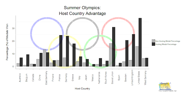
Graph of the Week has been used as an educational tool several times since its inception. For me, this is always very satisfying to see. The latest feature is in Participatory Science in which they exhibited the 2014 Winter Olympics "home court advantage" article published in 2012. If my work ends up inspiring young minds to think critically, then our collective future is bright.

If you are an educational organization and wish to you materials on this site, contact me. As long as you cite Graph of the Week with all of the appropriate links, then I'm all for it.

I hope to see many more features like this!

Sunday, February 23, 2014

Olympic home-court advantage: Russia wins big

I wrote an article about two years ago reviewing various methodologies to predict the home country's medal count. Nearly all of the relevant research at the time predicted between 24 and 31 medals, which is the range I used, backed by that same research.

Russia won 33 at the 2014 Winter Olympics - more than anybody predicted at that time.

The evidence strongly suggests that the hosting country will indeed outperform its previous results. Here is a table revealing this notion:

YearMedals Awarded
2014*

2010
33

15

200622
200213
* Olympics held in Sochi, Russia


For 2018, the Winter Olympics will be held in Pyeongchang, South Korea. How many will they grab? Stay tuned for a future article, but rest assured, it'll be more than they've ever won in years past.


Wednesday, November 27, 2013

Are you nuts for nuts?

In this article ("Eat Nuts, Live Longer") by Alexandra Sifferlin, she reports on a study which examined the causes of death of health professionals. One of the interesting aspects of the study revealed a link between nut consumption and longevity. In other words, the more frequently the subjects ate nuts, the less chance that they died in the same time interval as those did not. Even simpler, that means eating nuts = living longer.

What are your chances of living longer?

For that answer, I had to find the original research article - the online version of which was published in the New England Journal of Medicine on November 21, 2013 (see "Association of Nut Consumption with Total and Cause-Specific Mortality"). Without going into detail, the most cited statistic from that study is the 'hazard ratio'. For this study, this number basically tells us the likelihood of a person who eats nuts dying within the same timeframe as a person who doesn't eat nuts.

However, the article has much more detail than that - it actually computes the hazard ratio in increments - depending on how many times per week subjects said they ate nuts. Now that's graph worthy!

And here it is:

eat nuts live longer
Title font by: Jonathan Harris
Image provided by: Wikipedia Commons

Now that's pretty interesting. In graphical terms, we see that the more you eat nuts, the better chance you have of living longer. Obviously, there are lots of variables at play here, however the researchers went to great lengths to filter those out. And, for those who can't read all of the statistical jargon, this graph provides you with all of the information you need to 'take away' from all that research.

Now, if you'll excuse me, I have a handful of almonds to munch down...

Monday, November 18, 2013

Depressed? Perhaps you had childhood abdominal issues...

child bent over abdominal pain
I admit that when CBS News published an article with the title "Childhood stomach aches may lead to anxiety, depression as an adult," I cringed a little. My first thought was Uh-oh, this sounds like another mis-understanding of the "correlation does not imply causation" phenomenon. After all, I see people generalizing all the time - especially in the news.

However, upon further review, I found out that this new item was simply summarizing a scientific article entitled "Functional Abdominal Pain in Childhood and Long-term Vulnerability to Anxiety Disorders" which was published in Pediatrics in August, 2013. Hmmm, perhaps this story wasn't some half-baked nonsense?

Although I was unable to see the actual paper and therefore unable to see the methodology for patient selection, it appears as though a good deal of statistical rigor was applied to the experiment. Let's assume that everything contained in the journal article is statistically solid so we don't get bogged down on that aspect.

All of that being said, the CBS treatment of the subject would have been greatly improved with a simple graph. It doesn't need to be fancy or flashy - just something that people can quickly grasp. Using the numbers that CBS printed (the original Pediatrics article had several numbers denoting different aspects of the experiment which were important, but we'll leave those out for now and focus on the story itself), it could have looked something like this:


child stomach ache change of mental disorder
Just a little graph goes a long way...


That's better. Now I have the ability to understand the gist of the article with a glance. If I choose to read further, I can, but at least now there is a snapshot of the data in my mind to which I can refer. Let's hope the journalism industry adopts this sort of practice in a wide-spread manner so that we can all benefit.


Notes:

All imagery used in this article created by Patrick Rhodes. Any reproduction of same requires my permission. That being said, you are free to cite this article freely, as long as you include a link to it.

Graph fonts created by:
Khrys Bosland